
Stavanger R&B– A Responsive Event Platform
Stavanger R&B is a conceptual platform for discovering and booking local and international R&B events in Stavanger, Norway. The goal was to design a smooth, elegant user experience that captures the rhythm and warmth of R&B culture
Overview
This project was created as part of the Figma Advanced – Final Distinction Project by Bring Your Own Laptop.
The brief was to design a responsive event platform — first as a mobile app, then adapted to a desktop website — and present it as a UX case study.
It was a solo project, where I was responsible for the entire UX and UI design process — from concept and research assumptions to final prototypes.
The Challenge
Existing event apps often feel cluttered or generic, making it hard for users to find niche music events.
The challenge was to design a product that feels exclusive yet intuitive, with consistent navigation across both mobile and desktop.
The Approach
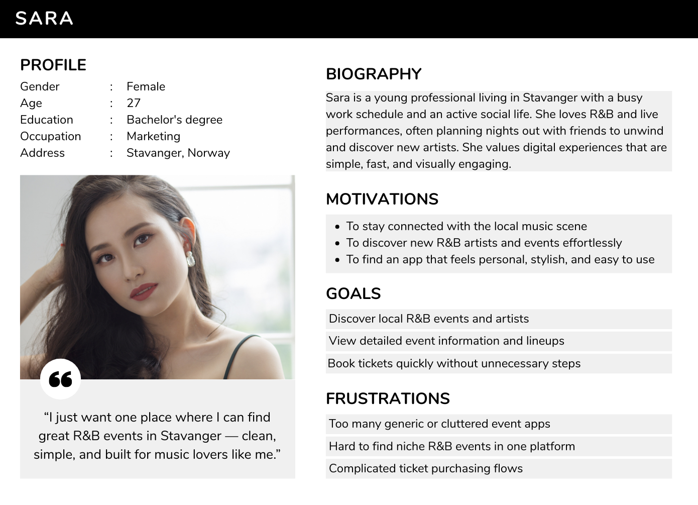
Since this was a conceptual project, no formal user research was conducted. Instead, I explored assumptions about how people browse, compare, and book event tickets.
My focus areas were:
Understanding how layout and interaction differ between mobile and desktop experiences.
Building shared components and styles in Figma to ensure consistency and efficiency.
Exploring color, typography, and rhythm to create an interface that reflects the energy and smoothness of R&B.
Design Process
Define: Reviewed the brief, created a persona, and defined the goal of an elegant, rhythmic event platform.
Ideate: Sketched user flows and low-fidelity wireframes for both devices.
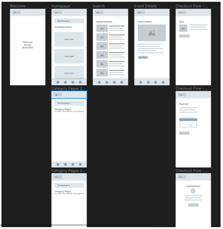
Low Fidelity Wireframes
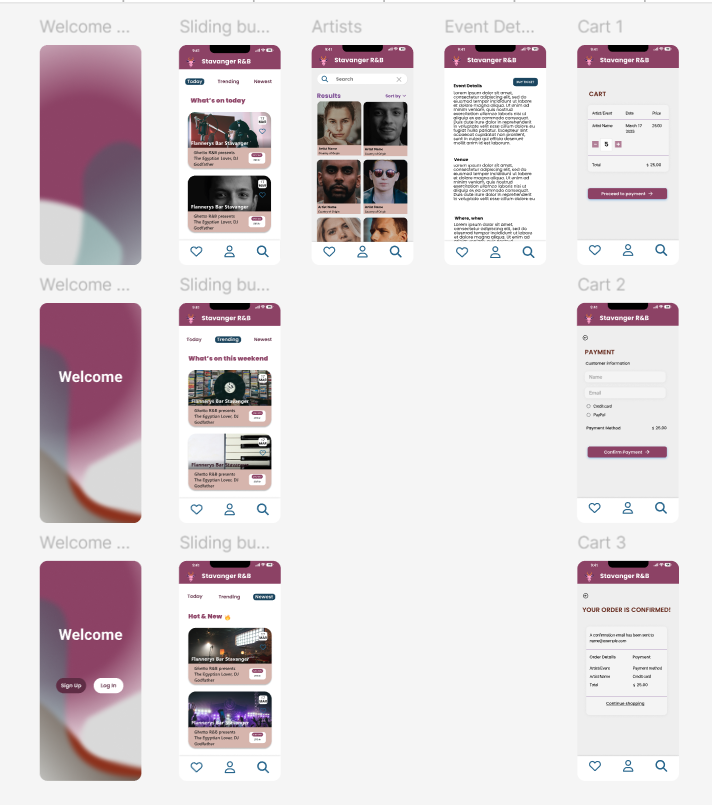
High Fidelity Wireframes
Prototype: Developed high-fidelity mockups using shared Figma components and a unified design library.
Test & Iterate: Conducted one usability test with a user familiar with event apps. Feedback was positive regarding visual clarity and navigation, with minor improvements made to spacing and hierarchy.
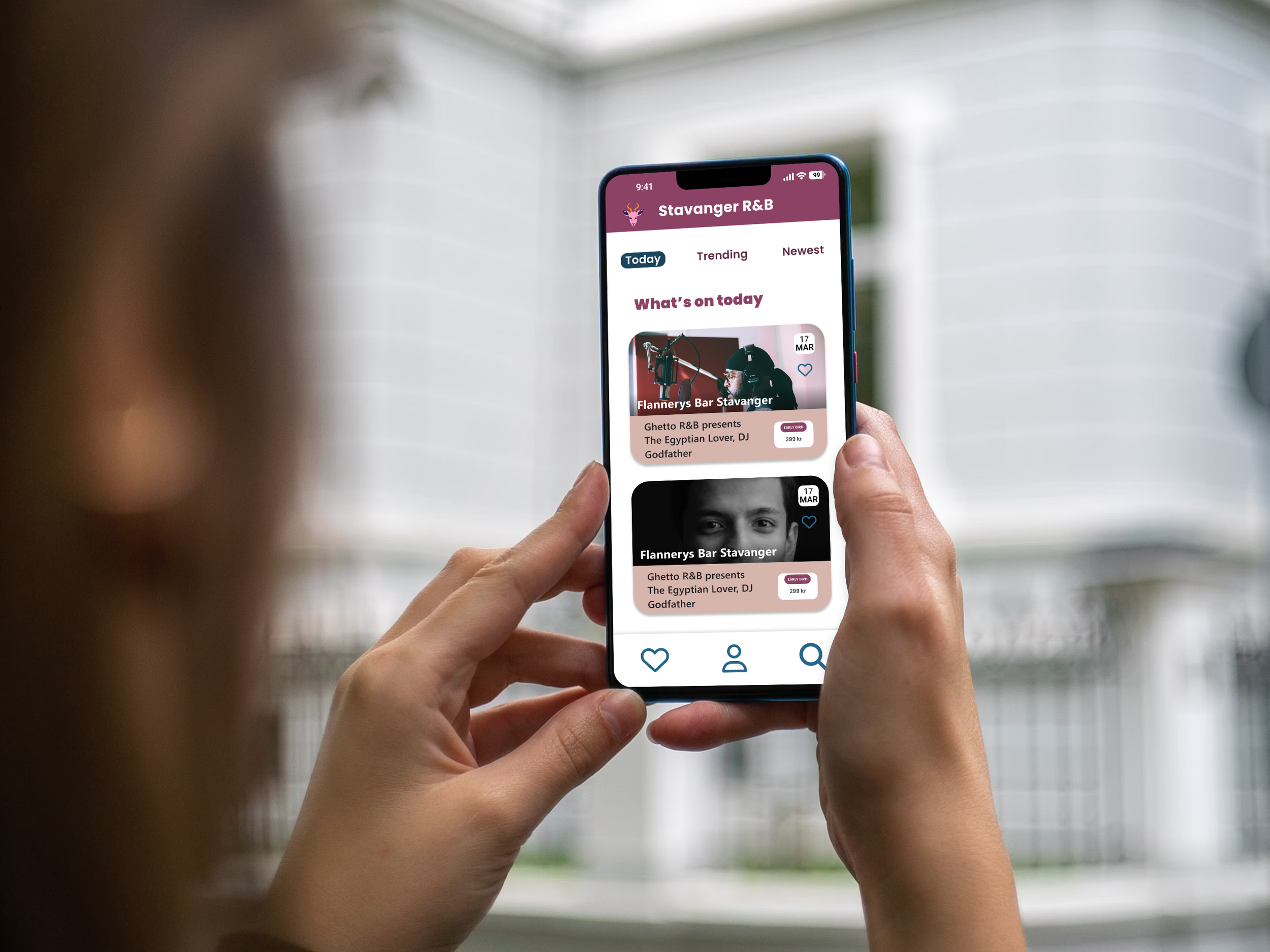
The event card component was designed to display artist details, ticket information, and event date in a compact, modular format. It was built as a reusable component using Auto Layout and shared color styles to maintain consistency across the app.
Component Design — “Event Card”
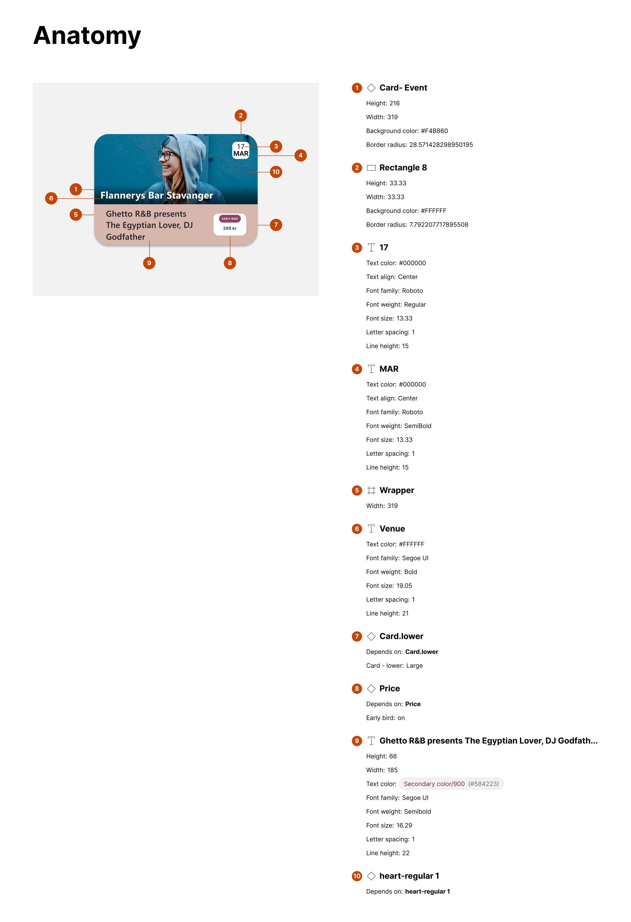
Anatomy of the event card component — showcasing structure, text styles, and visual hierarchy.
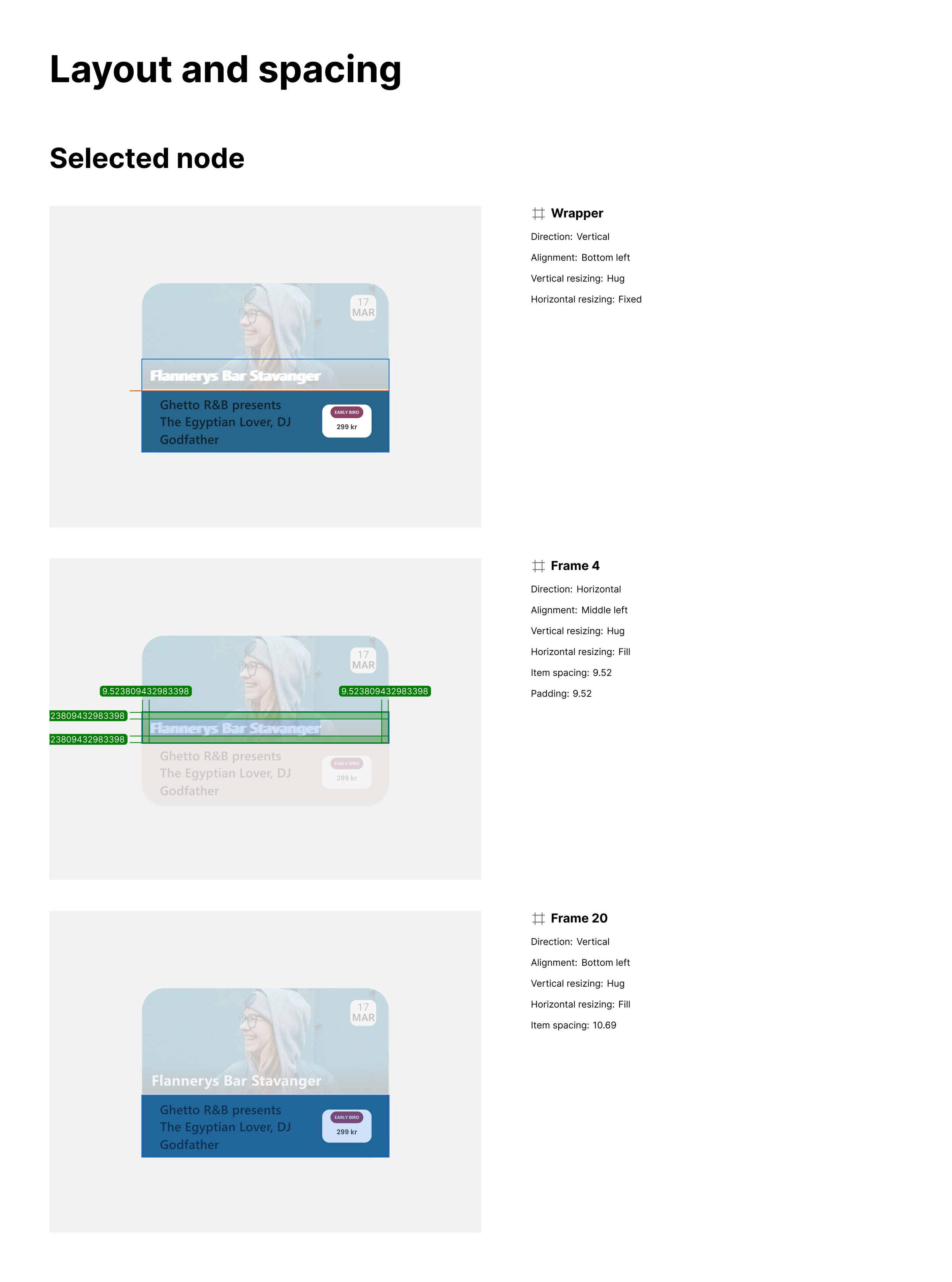
Auto Layout setup and spacing details for the card component — designed for flexibility and responsive behavior.
Creating this component helped me strengthen my understanding of Figma’s Auto Layout, responsive resizing, and reusable component structure.
It was primarily used in the mobile version of the design, allowing for faster iterations, consistent updates, and smooth scalability across different screen sizes.
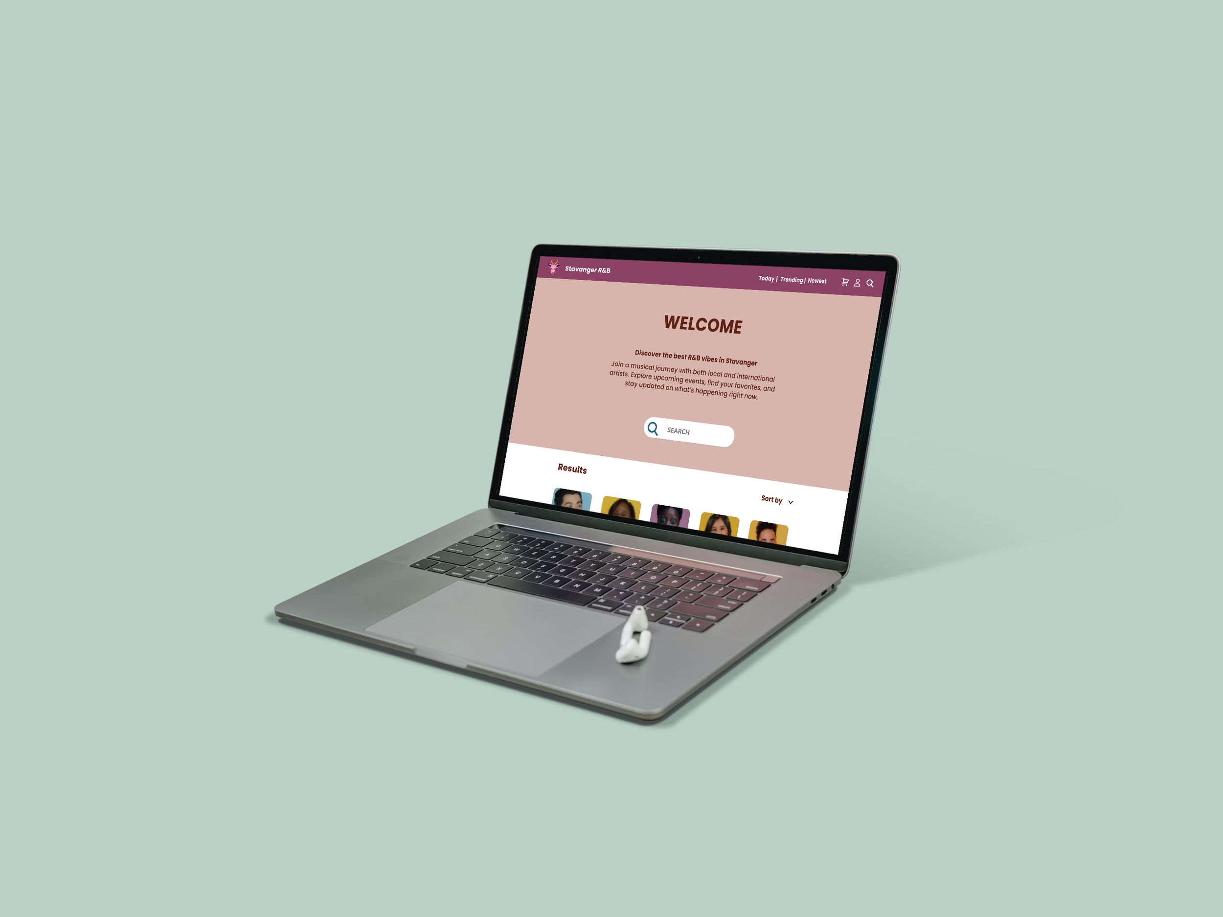
The Solution
The final design allows users to:
Discover R&B events and artists through a clean, image-focused layout.
View essential event details such as venue, time, and price at a glance.
Purchase tickets seamlessly within the app.
Enjoy a consistent experience when switching between mobile and desktop.
The design combines warm, smooth colors and modern typography, creating an atmosphere that feels both digital and soulful — just like the music it represents.
Outcome & Learnings
Through this project, I learned how to:
Translate one design system across multiple platforms.
Maintain brand identity through color, rhythm, and component reuse.
Balance aesthetics with usability in a music-focused context.
Document a full UX process, from brief to prototype, as a portfolio-ready case study.